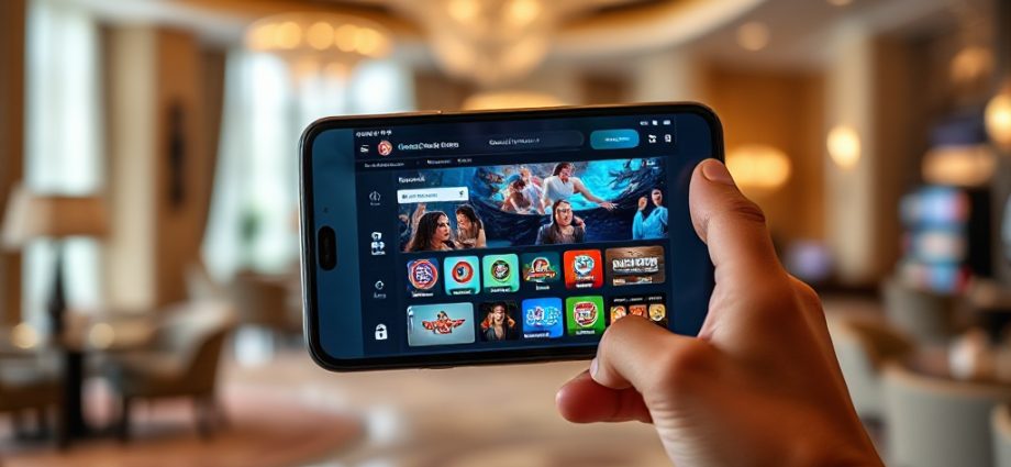
How tk999 Speaks Without Words
How much do you understand about tk999 before you read a single word on the screen? Quite a lot, in practice. A betting platform aimed at Bangladeshi users leans heavily on shapes, colour and layout to tell people where they are, what they can do next and whether an action is safe. The text is there, but the visuals often arrive first.
That matters because a large share of visitors arrive on a phone, in a hurry, possibly in bright daylight, and they make a snap judgement in seconds. This piece looks at how tk999 communicates through icons, colour coding, imagery and hierarchy, and what that means for the people interpreting it.
Icons as a First Language
Icons are the fastest layer of meaning on any betting interface. A small football, a set of cards, a spinning wheel or a trophy can signal a category before a label is read. On tk999, the icon set effectively acts as a table of contents: sports on one side, casino-style games on another, account tools tucked into a familiar corner.
The strength of this approach is speed. A user who has used any mobile app in the last decade already knows that a silhouette means profile, a gear means settings, and a wallet or coin shape means money. Icons borrow meaning from everywhere else on the phone, so the platform does not have to teach them from scratch.
The weakness is ambiguity. A generic ball icon does not tell you which sport, and a card icon does not tell you which game. When icons are the only signal, users guess, and guessing is where confusion starts.
Where Icons Help and Where They Fail
- Help: navigation, account access, deposit and withdrawal entry points, back buttons.
- Fail: distinguishing similar game types, explaining rules, showing odds or limits.
The pattern is consistent: icons handle movement and orientation well, and detail poorly. A design-curious reader should notice that the most important icons are the ones that never need a caption.
Colour Coding and What It Signals
Colour is the second layer, and on betting platforms it usually does emotional work. Warm colours such as red and orange tend to mark action buttons, live events and anything urgent. Cooler tones mark navigation, background panels and secondary information. Green appears where money or confirmation is involved, and grey is reserved for things that are inactive or unavailable.
On tk999, this coding is consistent enough that a returning user can find the deposit button by colour alone. That consistency is more valuable than any single shade. A colour only works as a signal when it is used the same way every time, and breaking that rule once creates doubt that lingers.
There is a practical warning here for users as well as designers. Bright, saturated colour draws the eye toward whatever is most profitable for the platform, not necessarily what is best for the visitor. A red badge is not a recommendation; it is a visual prompt. Reading colour critically is part of using any betting interface well.
Imagery, Motion and Visual Hierarchy
Beyond icons and colour, imagery sets the mood. Promotional banners, game thumbnails and event graphics carry most of the emotional weight on the homepage. They communicate excitement, scale and variety without a sentence of explanation. For a Bangladeshi audience, cricket imagery in particular does a lot of silent work, signalling relevance before any text confirms it.
Hierarchy is the quieter skill underneath all of this. Size, spacing and contrast decide what a user sees first, second and third. A well-built screen puts the primary action in the largest, most isolated element and lets everything else recede. When hierarchy is weak, everything competes and nothing stands out.
The tk999 layout follows the common mobile pattern: a prominent top area for featured content, a grid of tiles below, and a persistent bar for navigation. That structure is familiar enough that most users can move through it without instructions, which is exactly the point of visual design in a competitive market.
Reading a Screen in Order
- Notice the largest element first; it is almost always the intended starting point.
- Scan the tile grid for category icons that match your interest.
- Check colour cues to separate active options from inactive ones.
- Look for the account and payment icons before committing to anything.
Following that order turns a busy screen into a readable one. It also exposes weak spots, such as a tile that looks clickable but is only decorative, or a button that blends into its background.
What Visual Communication Means for Comprehension
The overall picture is a platform that communicates in layers: icons for orientation, colour for urgency, imagery for mood and hierarchy for order. Each layer is useful, and each can mislead when it is the only thing a user relies on. Visual signals speed up understanding but do not replace reading the terms, the limits and the account rules.
For anyone exploring tk999, the sensible habit is to let the visuals guide movement and let the text confirm decisions. A button that looks obvious still deserves a second look before it is tapped, especially where money is involved. The design is doing its job when it makes the next step clear; the user is doing theirs when they check what that step actually is.